Manoa Eateries
Table of Contents
Build Status
![]()
Overview
Manoa Eateries is a project created for ICS 314 by Brooke Maeda, Andee Gary, Albert D’Sanson, and Eliya Nakamura to provide students with the opportunity to see what is available to eat on campus. Using tools such as Bootstrap, React, HTML, and CSS an application will be made to allow users to view various food options, vendors to add any new items or daily specials. A landing page will show users the ability to see the various food options on campus and filter it out to find what they are looking for.
Project Goals
- Give users a convenient place to view the menu items of the various food vendors at UHM
- Display menu items based on the specific day and time
- Filter the data based on item type (ethnicity, gluten free, vegetarian, etc.)
- Implement vendor roles that can specify what days and times an establishment is open, and allow for menu changes as needed
- Implement user roles that can specify a person’s dining preferences
- Implement admin roles that can add vendor roles to users and modify any aspect of the system
Developer Guide
Installation
First, install Meteor.
Second, visit the Manoa Eateries application github page and download the source code as a zip file or make a fork of the repo. However you do it, download a copy of the repo to your local computer.
Third, cd into the Manoa Eateries app/ directory and install the libraries with:
$ meteor npm install
Fourth, run the system with:
$ meteor npm run start
If all goes well it will appear at http://localhost:3000/.
ESLint
You are also able to invoke the ESLint command from the command line with:
meteor npm run lint
Here is an example showing that no ESLint errors were detected:
$ meteor npm run lint

> manoa-eateries@ lint /Users/johndoe/github/manoa-eateries/app
> eslint --quiet --ext .jsx --ext .js ./imports ./tests

$
ESLint should run without generating any errors.
User Guide
-
Landing Page
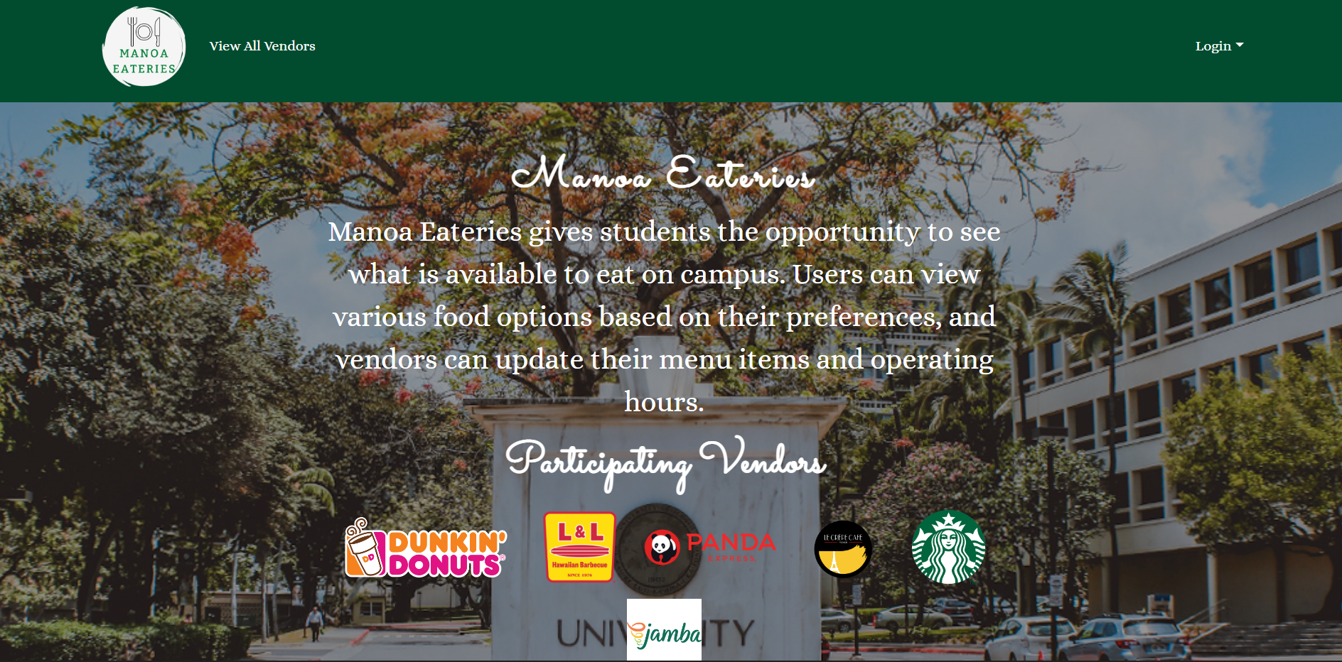
When users first enter the site, they are greeted with the landing page. This displays the mission of Manoa Eateries and lets the users know the purpose of this website. -
List All Vendors Page
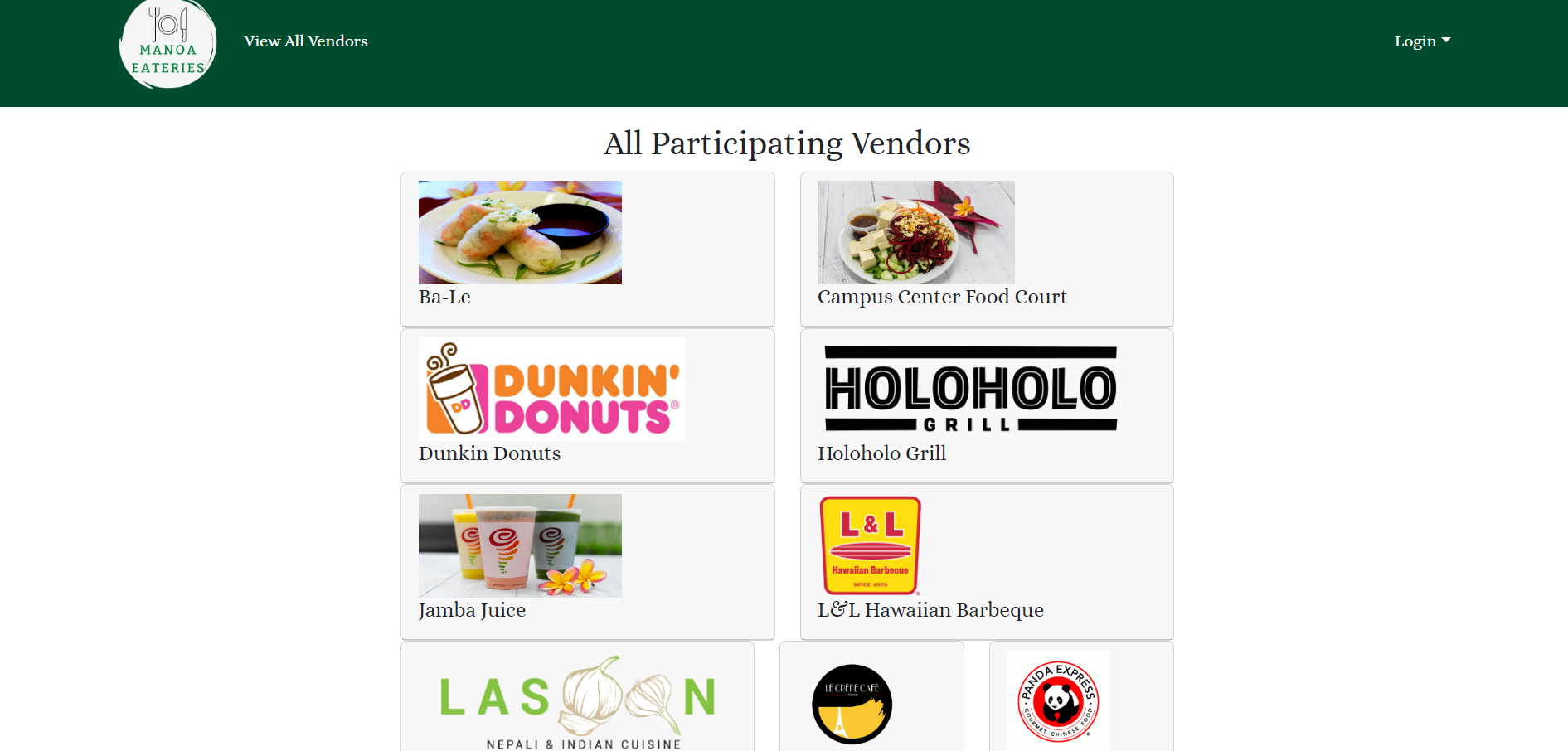
Users can see the participating vendors on this page without signing in. This allows users to see if their desired restaurants are included on the website and help them decide if they should sign up. -
Open Now Page
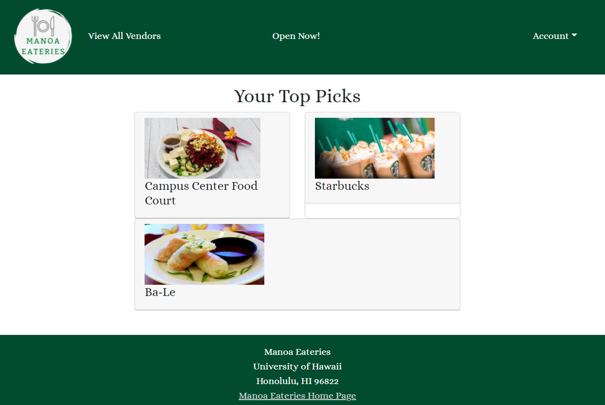
Once a user is signed in, they can see a few vendors that are currently open. Every time a user opens this page, they can see a new random list of vendors to keep their food choices exciting. -
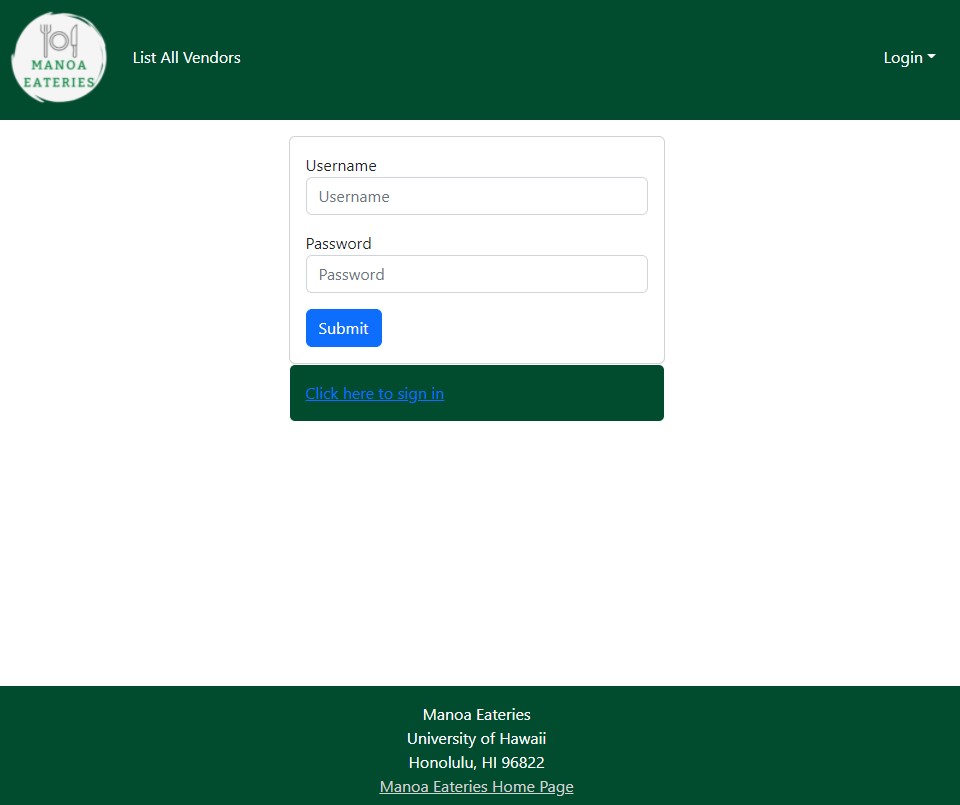
Sign in Page
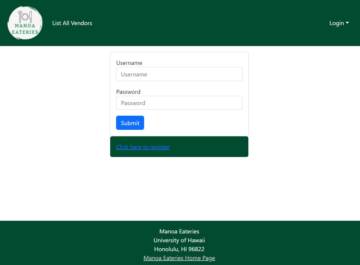
In order for users to be able to see more than just a list of vendors, they must sign in. Once signed in, they will still be able to see the list all vendors page, in addition to the new pages described below. -
Sign up Page
If a user does not have an account with us, they have the ability to create one. -
Add User Preferences Page
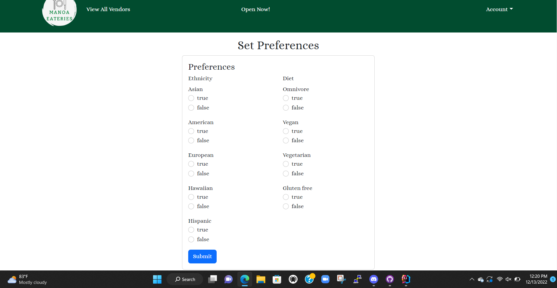
After creating an account, users will be able to add their personal food preferences. -
User Profile Page
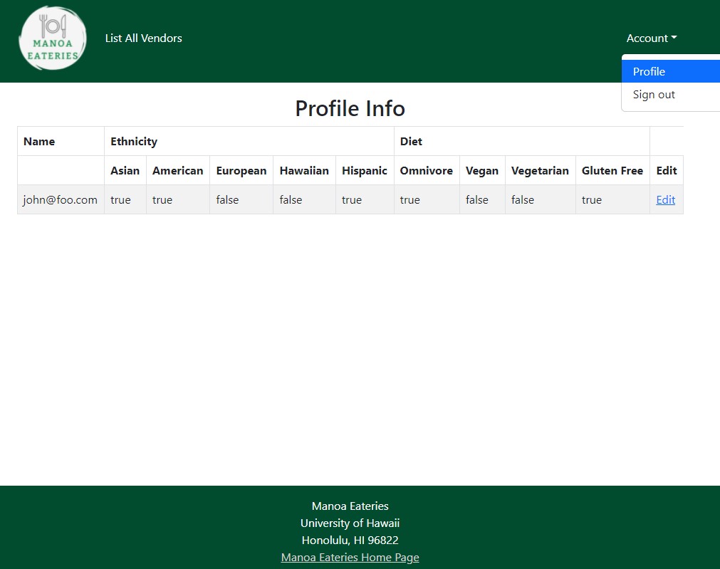
Once logged in, users can navigate to their profile page. Here they can see their name and preferences. -
Edit User Page
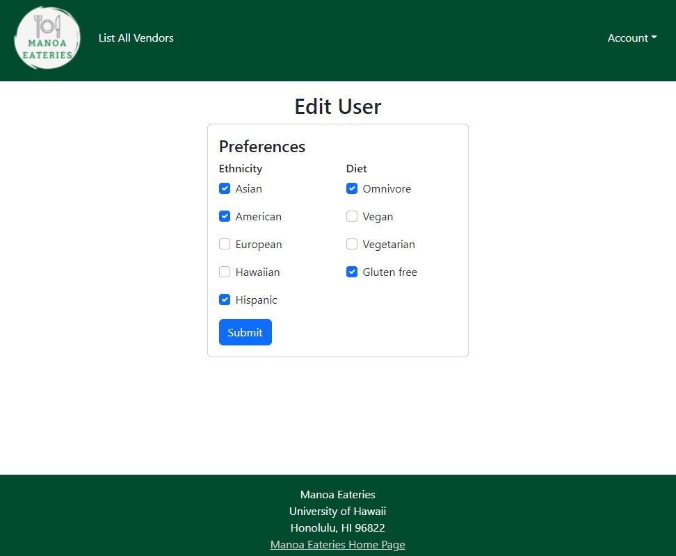
If a user decides that they want to change their preferences, they can navigate to the edit user page. With this, they can specify what types of food they enjoy. -
Vendor Profile Page
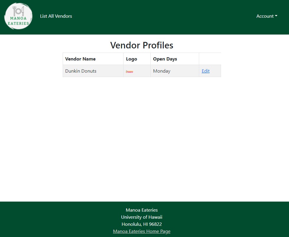
When a vendor signs in, they can see their profile information, which contains their name, logo, and their operating hours. -
Edit Vendor Page
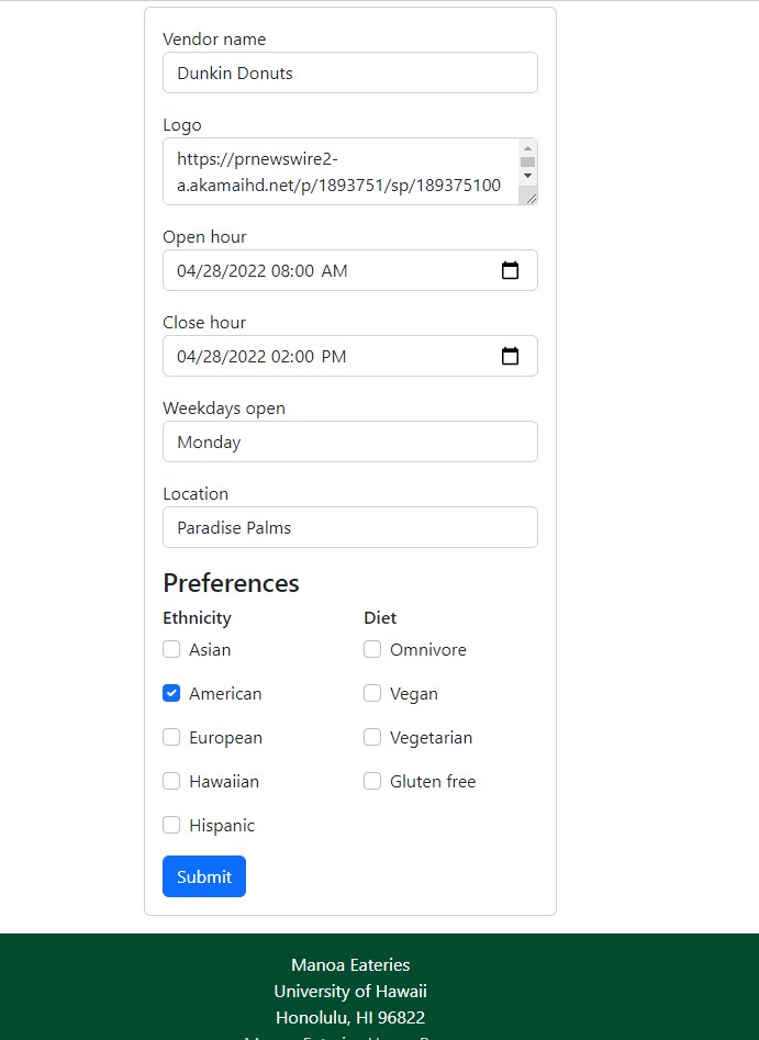
If a vendor wants to change their information, they may do so on the edit vendor page. Here they can set their name, logo, hours of operation, location, and preferences they cater to. -
Admin Page
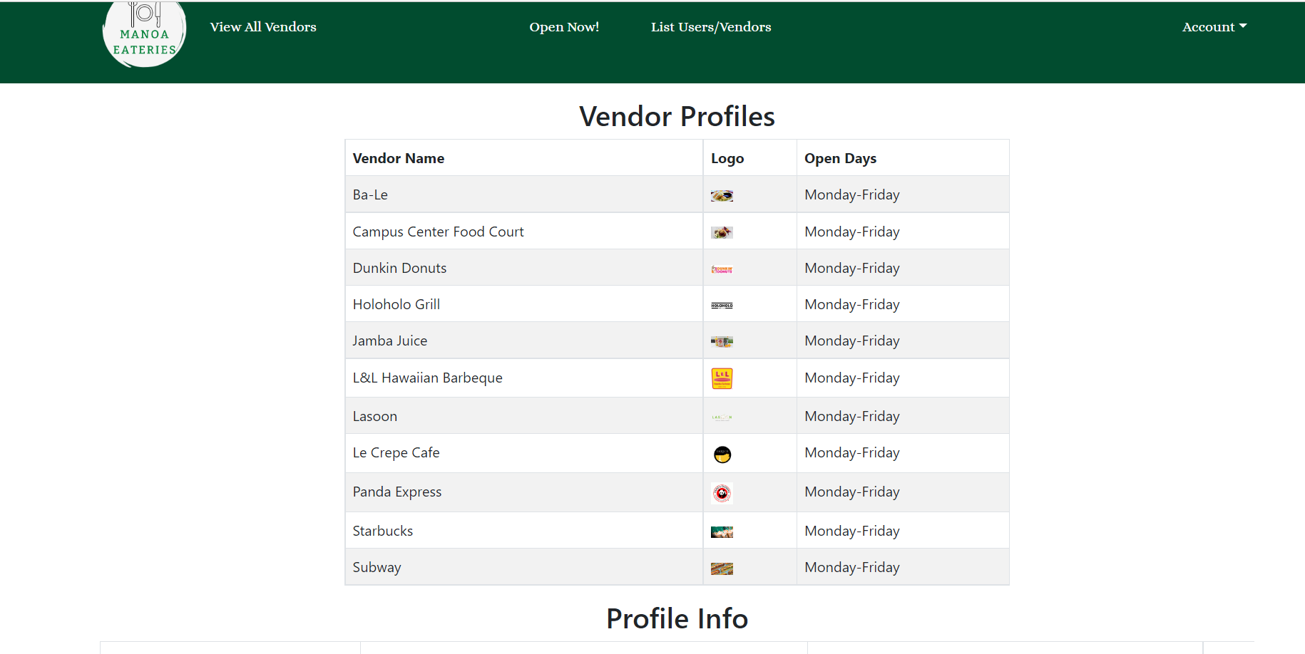
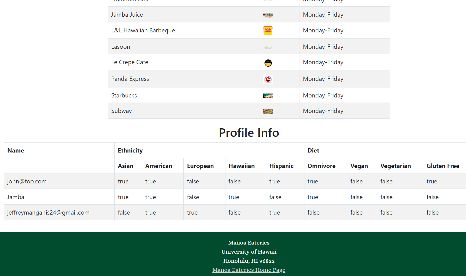
This is the admin page, where they are able to see all of the vendor information and the preferences of registered users.
Projects
The goal of this milestone was to create mockups to have an idea of what our pages will look like. We also made a landing page that tells users the purpose of our website.
For this milestone we wanted to improve functionality by adding pages and forms to our website.
Finally, we want to implement a significant amount of real information into our database. We also will be receiving community feedback.
Deployment
Community Feedback
Karrie M.
- I liked that there are many options for the - eateries and that the photo and name of the vendors make me want to go there.
- One thing to improve on is to show the location in addition to the logo and name.
- I think this is a good simple tool to look at all the food choices I have on campus and I would definitely use it!
Tyler B.
- I love how I can add my favorite food choices and accounts for a wide array of diets. Additionally, the website is very aesthetically pleasing and user-friendly!!
- I would like to see more restaurants along with their menu or pictures of food.
- Overall great website!! If you ever publish it, I think it would be very beneficial for all students, and I can’t wait to use it!
Jeff M.
- It was an aesthetically pleasing site and very convenient to see what sites are open.
- Some of the fonts could be changed to look nicer with boldface fonts.
- Very organized website, look forward to seeing it in deployment in the future!
Kenton B.
- It was very easy to navigate, I liked that I did not have to ponder whether or not my favorite food places were open. Creating an account was quick and easy.
- I would like to see more menu items for each of the restaurants.
- I enjoy access to the home page with a user guide for understanding how to use the application.
Lynne N.
- I really liked the design of the landing page. The font and background image choices were nice! I also liked that we can easily see the participating restaurants without having to navigate to another page. The user/vendor accounts are another good feature and they are easy to use.
- I would like to see more options that we can filter the vendors by, such as cost and menu items.
- Having the ability to view any specials of the day for different vendors would be nice too.
Branden T.
- The home page itself looks pretty good, but the white text clashes just a little bit with certain parts of the background image. One suggestion I have is putting solid colored boxes behind the text for contrast. Even the Panda logo could perhaps use one too.
- I find it a bit weird how on the vendors page, about half have their logos and half have pictures of their products. It’s not a big issue, but it’d personally make more sense if they all had one or the other.
- When setting preferences for the first time, having the options be “true” and “false” rather than “yes” and “no” also seems a bit unnatural, from a user perspective. Otherwise, I feel like the site is very simple and easy to use. Good aesthetic and functionality.